Shopify Blog
From content library to editorial product
A catalogue, not a magazine.
The previous version of shopify.com/blog was structured like an article library: a long, uniform grid of every post in the system, equally weighted, sorted by category. Useful if you already knew what you were looking for. Confusing if you were a merchant arriving for the first time, hoping the brand would tell you what was worth reading.
The page also had a hero pinned to it: a "Start selling with Shopify today" banner that treated the blog as a marketing surface. Two jobs (publication and conversion) competing for the same real estate, neither one winning. The brief was to stop running them in parallel and decide what the blog actually was: a publication, with the brand confidence to recommend, not just list.

Page structure and components, inside a team-led redesign.
The Shopify Blog redesign was a cross-functional effort: a team across editorial, brand, content and design rebuilt the publication together. The voice, the visual register, and the typographic decisions were owned by colleagues I worked alongside. My contribution sat on the structural side: how the homepage was laid out, how an article page was put together, and the library of components the editorial team would compose stories with going forward.
The work split across two scales: the homepage as a destination (what does a merchant see when they land?) and the article template as a publishing tool (what does an editor have to compose stories with?). Both needed a structural backbone capable of holding the editorial register the rest of the team was setting on top.
architecture Section logic across the homepage and article surfaces. What leads, what supports, what gets cut.
modules Different layouts for different content kinds and different reading speeds.
template How a Shopify Blog story is structured page-level: from byline to share row.
library The modular toolkit editors compose articles with: lists, TOC, callouts, inline ads.
A system the editorial team could publish with.
The blog isn't a page, it's a publishing system the editorial team uses every day. The real work sat inside the article: a library of modular blocks an editor drops into the body copy: ordered and step lists, callouts and pull quotes, resource and guide round-ups, inline images, a table of contents, and conversion banners, each one integrated into the read without breaking it.
The point was variety with discipline. An editor needs enough range to ship a 5-step how-to, a long-form founder profile, and a buyer's guide from the same kit, but every block had to hold the editorial register the page promised at the top. The toolkit is the difference between a redesign and a platform: if the editors couldn't keep publishing without me in the room, the work didn't ship.
Headlines set the register. The system had to carry it.
The brand and editorial teams selected Aktiv Grotesk Extended as the headline face: a wide, confident grotesque that reads as publication, not marketing. That single decision set the visual register for the entire page. The extended width gives the headlines presence: before anyone reads a word, the typeface carries the weight of the writing.
The implication for the structural work was clear: every component had to be capable of holding that editorial weight: from the hero down to the smallest article card, from the table of contents to the inline pull quote. A great headline face on top doesn't make a magazine. The system underneath has to support the claim at every scroll position. The component library was built around that constraint: enough variety to publish freely, enough discipline to never break the register the team had set.
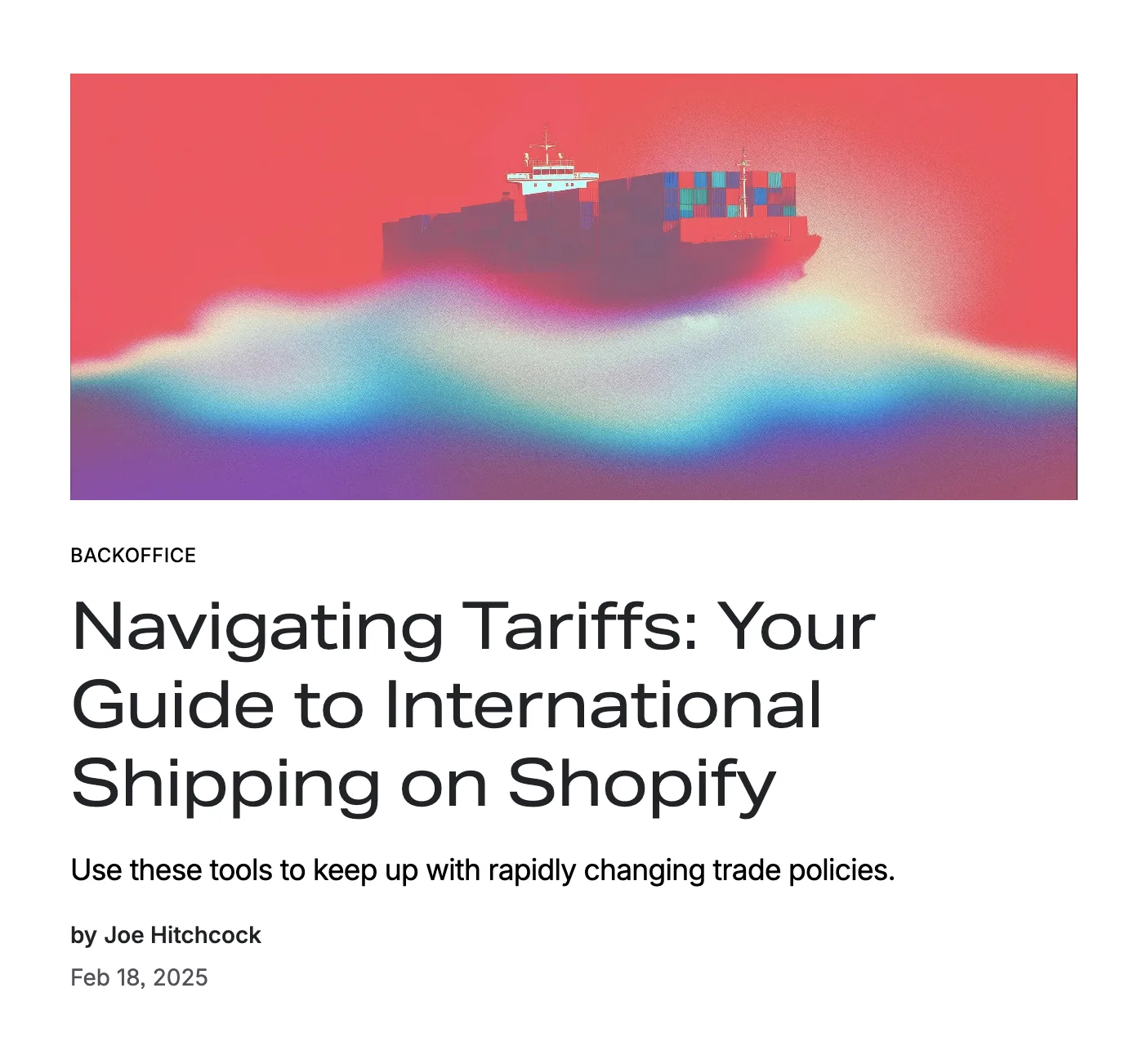
- 01 · Editorial image
- 02 · Category label
- 03 · Headline / Aktiv Grotesk Extended
- 04 · Standfirst
- 05 · Byline & date
Conversion, without breaking the read.
A publication still has a commercial job: the blog has to turn readers into merchants. The old page did it with brute force: a conversion hero pinned to the top, shouting before anyone had read a word. I took the opposite approach: a single inline conversion banner that meets the reader mid-article, in the flow of the read, once the writing has already earned their attention. A clear offer and one action, drop in your email and start selling, on-brand and integrated into the page rather than shouting over it.
It went head-to-head with the incumbent in an A/B test, and it was the clear winner, lifting conversion and contributing to overall revenue. The exact figures are Shopify-internal, but the takeaway is this whole case in miniature: restraint and craft aren't the opposite of commercial results. Done with taste, they're what produce them.
A blog that reads like a publication.
The new shopify.com/blog is live and the page now performs as an editorial product rather than a content catalogue. Articles get the hierarchy they deserve, sections give the page a rhythm, and the visual register matches the ambition of the writing. The editorial team has a system they can compose with, and the brand has somewhere to publish, not just somewhere to list.
See it live ↗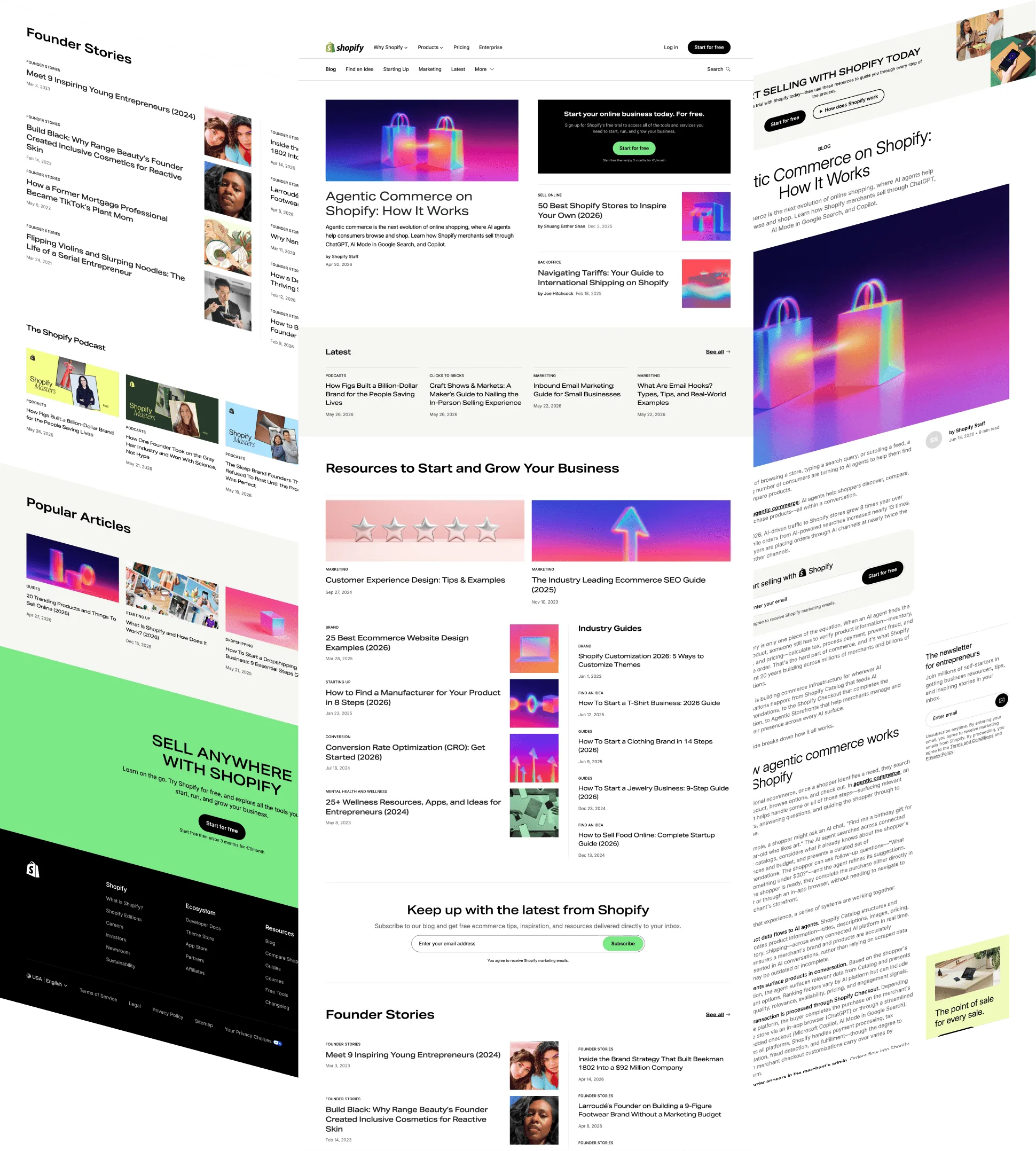
One system, two brands.
When Shopify spun up its enterprise publication, Commerce at Scale, the blog had to address a different reader: the C-suite and technical buyers evaluating commerce at scale, under Shopify's refreshed brand. I adapted the editorial system for it: a dark, corporate theme, the new brand's bolder typography, and a green-on-dark accent, a register that reads authoritative rather than friendly.
What it didn't mean was starting over. The same component library and page structure carried straight across; only the skin changed: colour, type, imagery, density. That's the dividend of building a system instead of a page: when a new audience and a new brand show up, you re-theme, you don't rebuild.
Screenshots & screen recordings © Shopify · All other visuals designed and coded by Olga Cacenabes
