La Española
Una aceituna como ninguna
The challenge.
La Española is one of Spain's most famous olive brands. Decades ago, they ran the kind of TV and outdoor campaigns that lodged themselves into the country's collective memory, but in recent years, the brand had quietly retreated to the supermarket aisle. The display you'd find of them was a label on a tin, and not much else.
They came to us wanting to change the game. Re-activate marketing campaigns, gain visibility off-shelf, and start showing up again in the places where Spaniards actually live: at the bar, on the table, in the kitchen.
Looking for the brand inside the ritual.
To make a real impact, we needed a brand language with enough confidence to land in any channel: packaging, posters, social, the website, and still feel like the same thing.
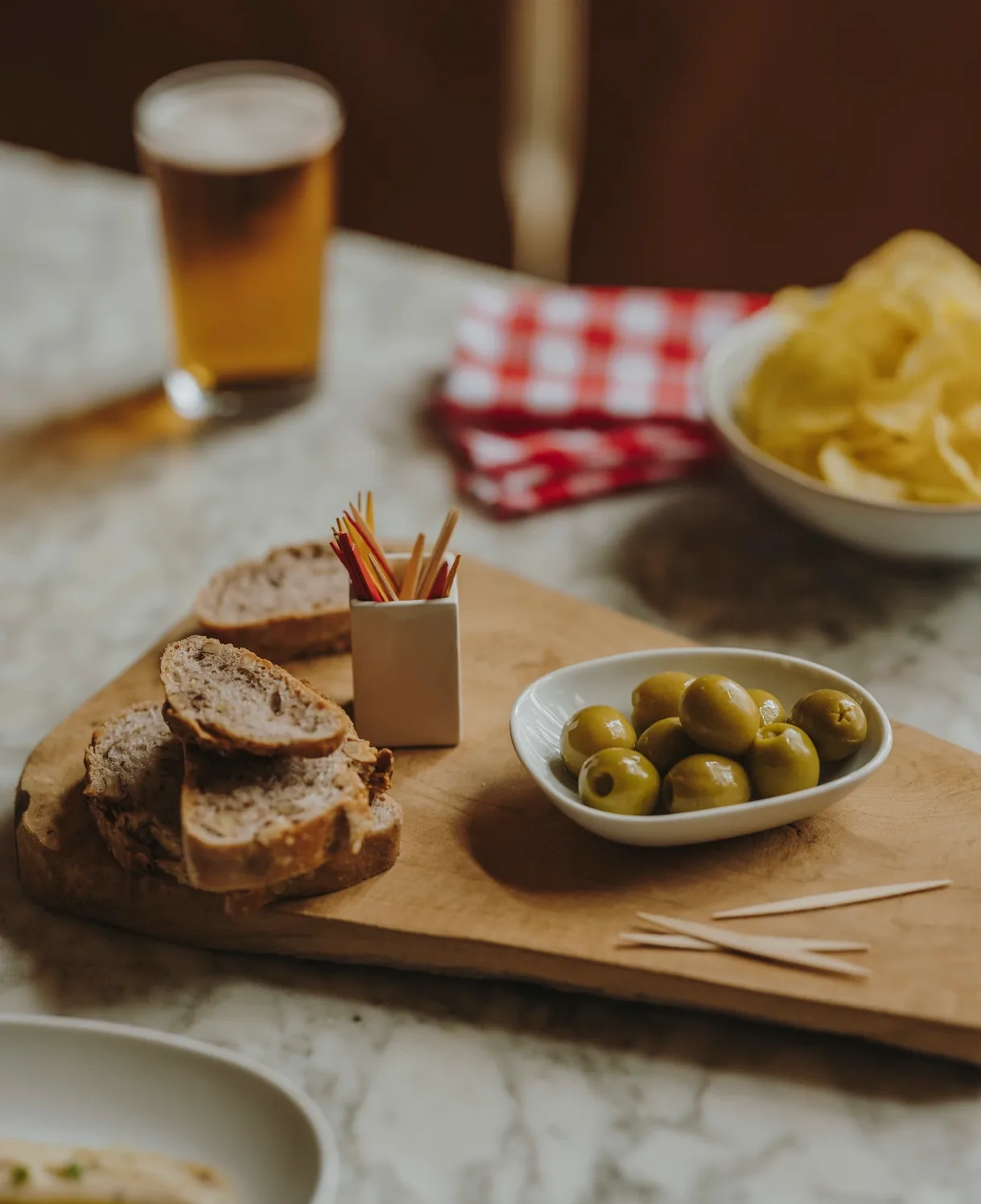
We pulled at the brand's Mediterranean roots. In Spain, regardless of age, the vermut is sacred: a drink before lunch, at the bar or at home, with a small bowl of crisps, a few olives, and the occasional tapa. La Española already lived inside that ritual. We just had to make the brand live there too.
A new pattern, built from olives and toothpicks.
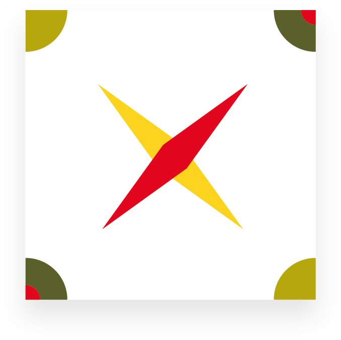
Across the Mediterranean, the tile is everywhere: on bar floors, kitchen walls, town squares, and the drawings shift from region to region like local accents. We made it the foundation of the new visual language.
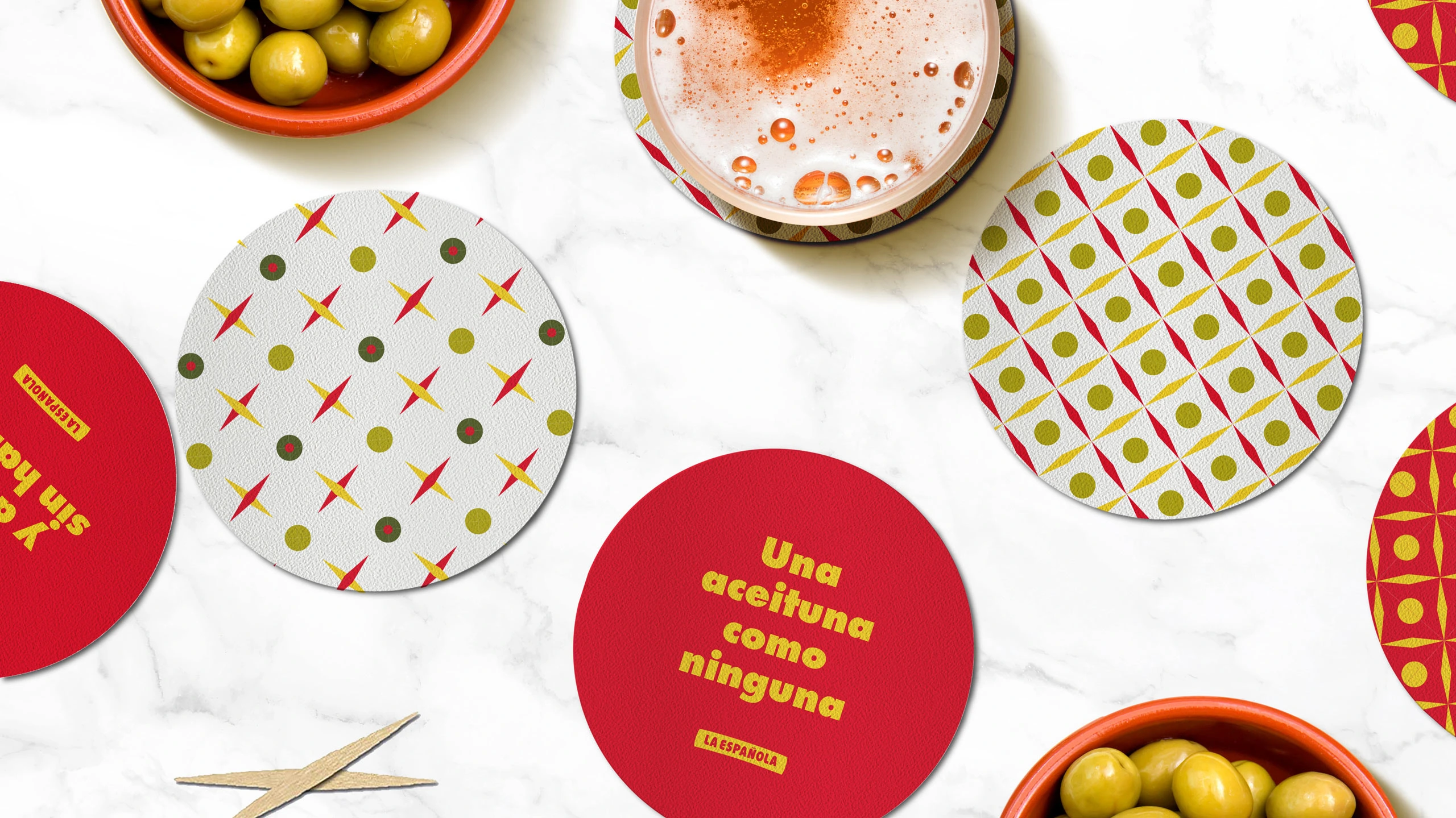
The motif redraws the classic four-pointed tile using vermut elements: the olive as the circle, the toothpick as the cross. From there, we built a modular system, different olives, different colourways, that maps onto each product variety while staying recognisably one family.




Una aceitunaBrand line · La Española
como ninguna.
Loud where it needs to be. Specific always.
The tiles combine into patterns big enough to catch the eye across a busy street or a busier feed. Around them, a couple of fixed rules keep everything in order.
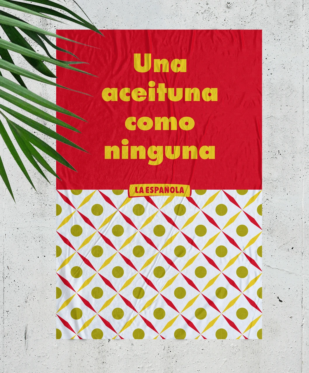
Corporate red backgrounds carry yellow Futura Bold headlines across every surface: posters, social, packaging variants, the new corporate site. Those two ingredients alone make the brand identifiable from across the room, and leave plenty of space for product photography to breathe.
Off the shelf and into the street.
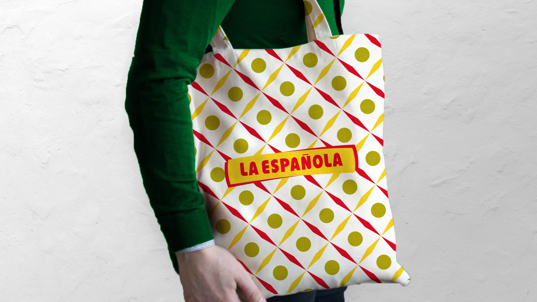
The system rolls out across every touchpoint: corporate stationery, OOH posters, packaging, branded merch, bar coasters and the corporate site that ties it all together. Each piece is a fragment of the same conversation.
Familiar light, real tables, real food.
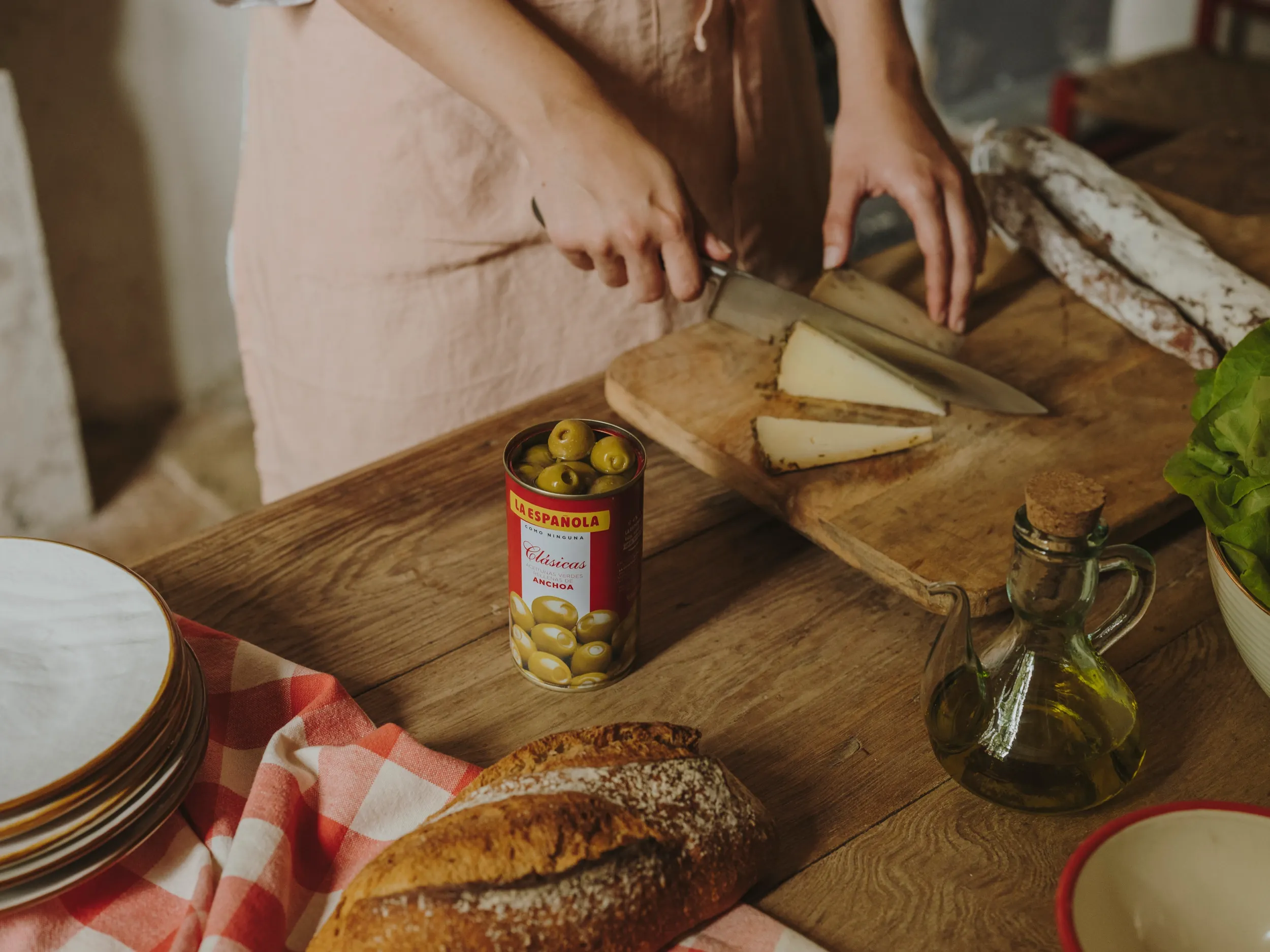
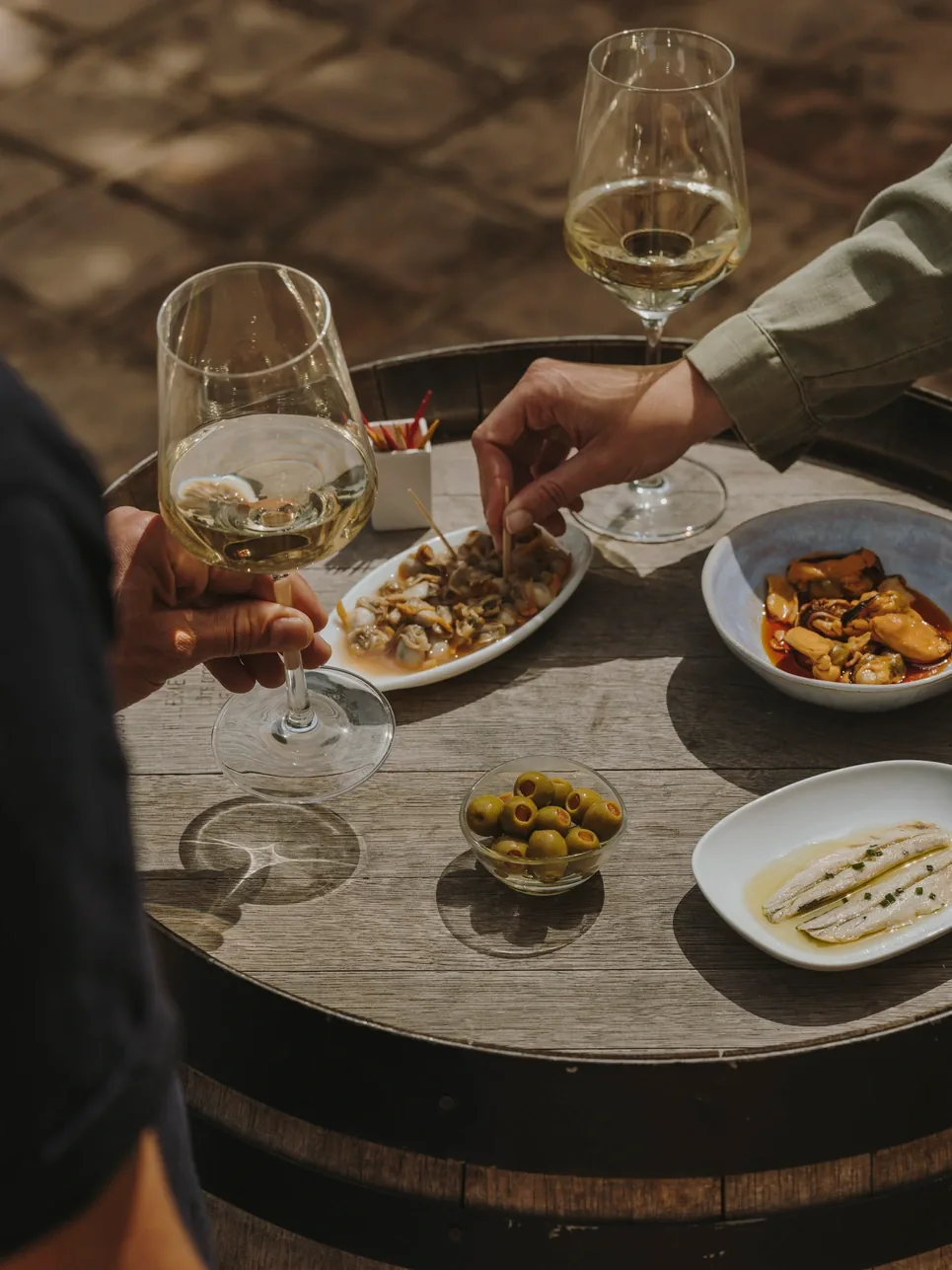
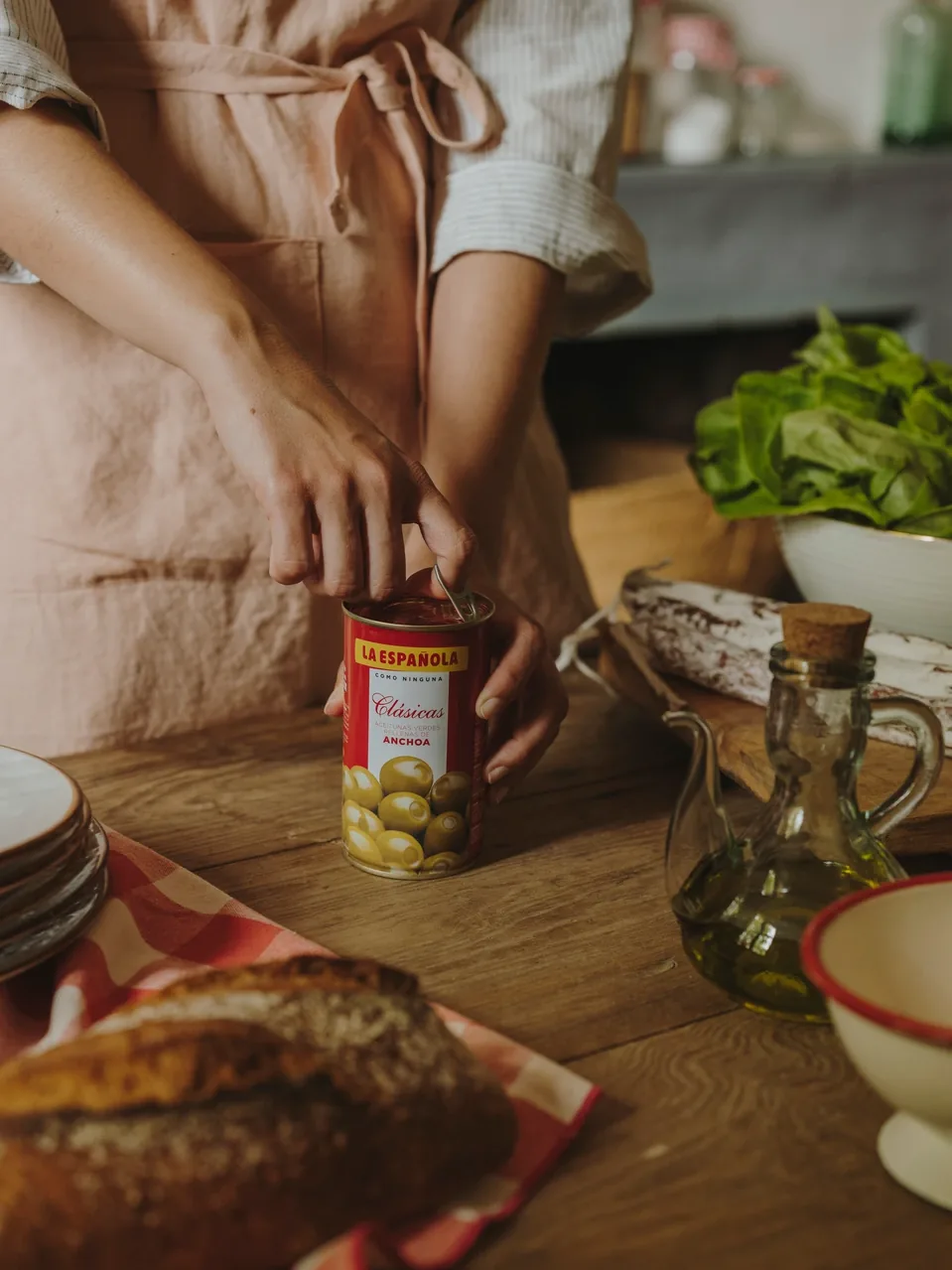
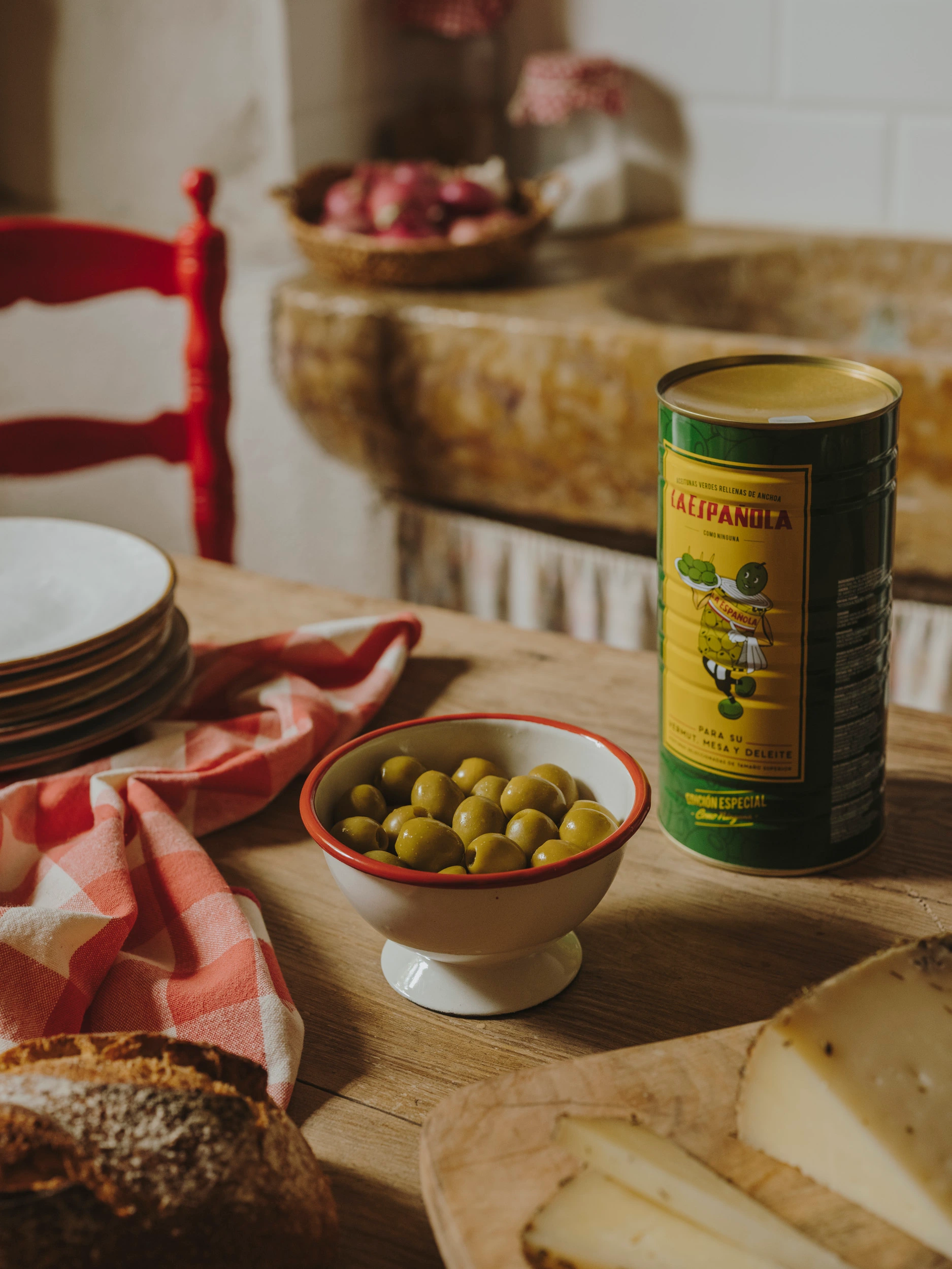
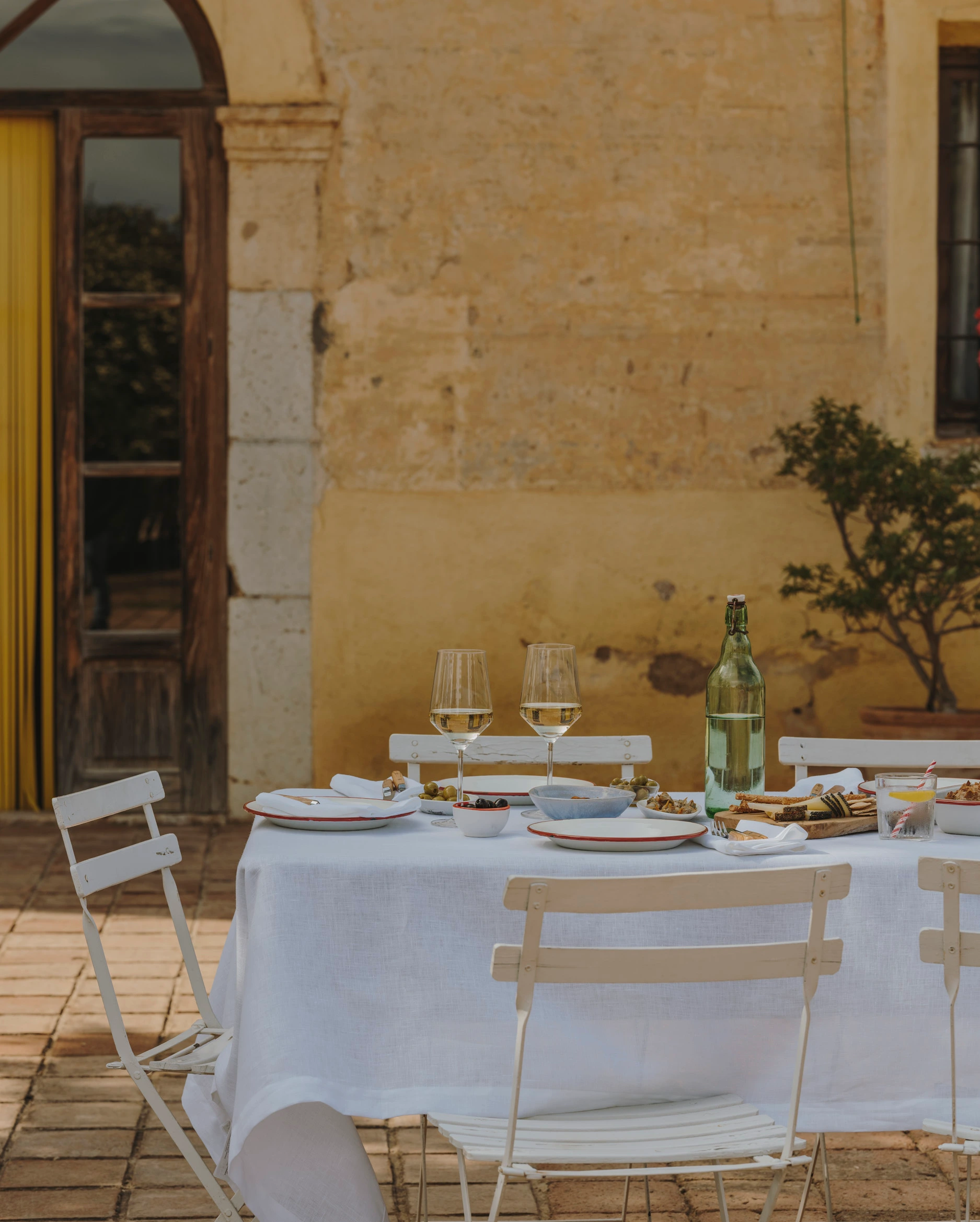
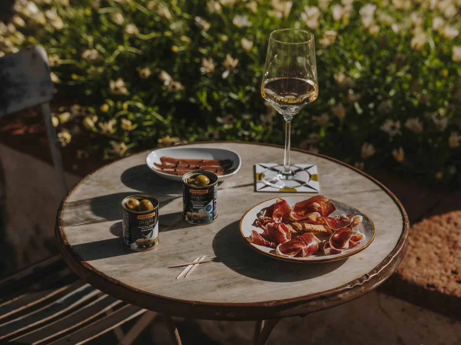
To carry the Mediterranean side of the brand, we shot a campaign in the kind of places the product actually lives: a rustic kitchen, a bar terrace at golden hour, a courtyard table set for lunch.
The tone was deliberately unstyled: relaxed light, hands mid-motion, a checkered tablecloth that's clearly been wrinkled by use. We wanted a sense of closeness: the warm, slightly imperfect feeling of being invited in rather than being sold to.
The product never poses. The tins show up the way they do in real life: opened on the table, passed around, parked next to the wine, with the tile pattern sneaking in on a coaster instead of a backdrop. You notice the brand the way you would notice it at a friend's table.
Photography © Salva López
