

Glovo Christmas
A Christmas campaign knitted stitch by stitch
A startup growing at a dizzying pace, that almost nobody knew yet.
Glovo was a Spanish startup growing at a dizzying pace, and still little known. To keep growing it needed to stand out among its competitors, not with another feature, but with awareness: more people understanding what the service could actually do for them.
They came to the agency to launch a Christmas campaign. The loudest, most crowded moment of the year to ask for attention, which a young brand can't outspend. So it would have to out-charm it.
Art direction and graphic design: the idea was born as a team.
This was an agency engagement, and the concept arrived almost instantly and collectively: the moment we heard the brief, we thought of a knitted Christmas sweater. From there I led the art direction and the graphic design of the campaign.
That meant designing the knitting-style pattern, drawing every 'knitted' graphic element, and carrying the look across each banner and mailing of the series.
- 01Art directionThe campaign's look: pattern, colour, composition across every piece.
- 02Graphic designThe knitted elements and the banners and mailings they live in.
A Christmas sweater, knitted for a delivery app.
As soon as we heard the brief, we thought of a knitted Christmas sweater and its typical drawings. The jumper is instantly Christmas: cozy, homely, a little bit funny, without borrowing a single cliché of discount urgency.
So the pattern came before the drawings. I built the fabric first: a knitting-style pattern drawn from the real thing, the V of a stockinette stitch repeated row after row, the texture every Christmas jumper is made of. Everything in the campaign would be knitted from this same yarn.


A cozy house, some trees and deers, and the Glovo logotype itself.
With the fabric in place, I started 'knitting' the drawings that would give the campaign its Christmas spirit. The choices were a cozy house, some trees, deers, and, of course, the Glovo logotype.
Rendering the logotype in stitches was the move that made it work. The brand wasn't sponsoring Christmas from a corner of the banner; it was woven into the sweater: the protagonist of the joke rather than an interruption of it.

Seven days, then three, then one.
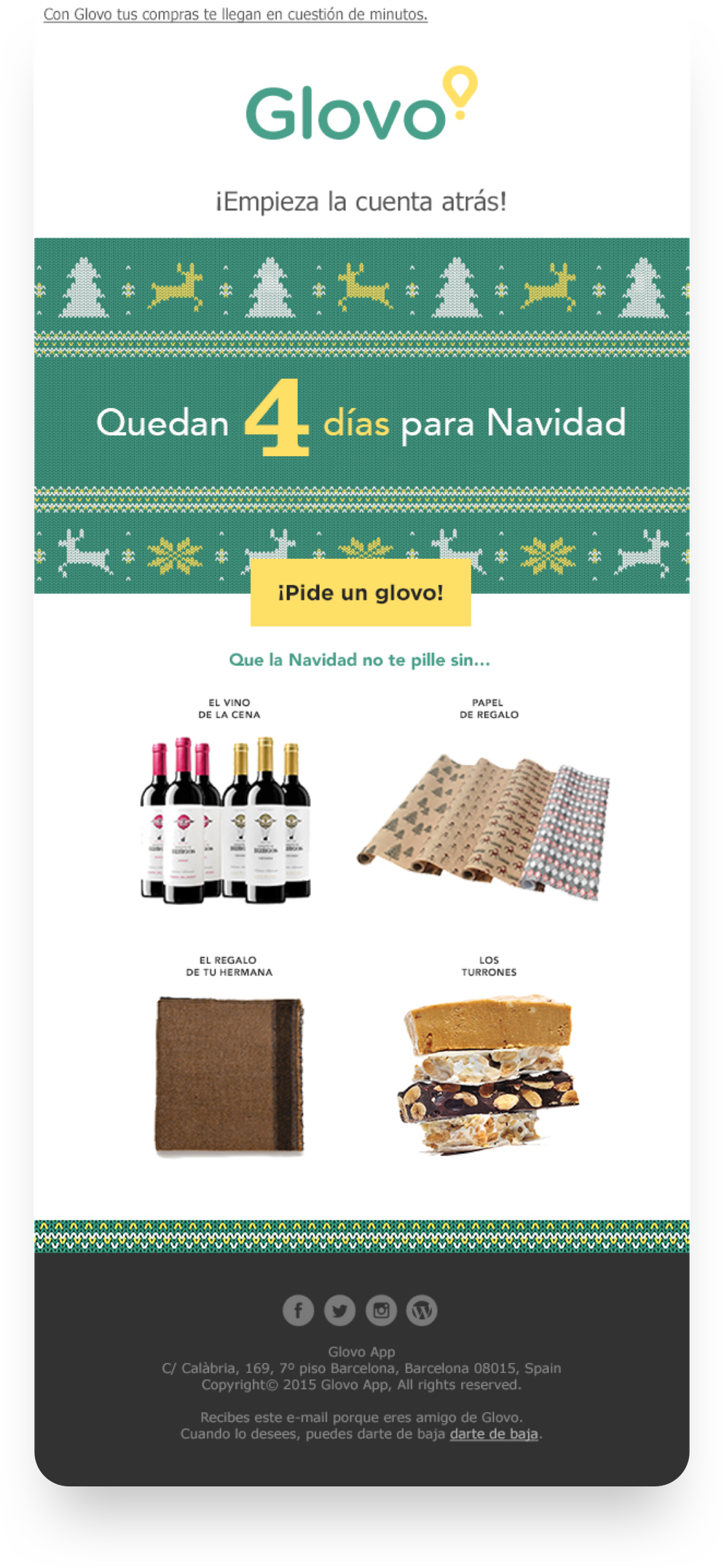
The countdown gave the campaign a pulse. The same knitted system returned to the inbox as the day approached, the number falling and the list of one-click items getting more last-minute each time: the typical things people always leave for last.
That rhythm did the awareness work the brief asked for: by Christmas Eve, the little-known yellow brand had spent weeks being the most charming thing in the inbox, and the most useful.
A countdown in the inbox, without the stress.
To turn attention into awareness, and awareness into orders, the campaign ran as a series of banners and mailing triggers counting down to Christmas day. Each send paired the knitted hero with the number of days left and a list of typical items, ready to order in just one click: the things busy people always leave for last.
The pattern worked as a kit of parts: header, knitted band, countdown, one-click list, CTA, so every trigger could be composed quickly as the countdown advanced, without the look ever drifting.
The result was a funny, effective campaign that solved busy users' last-minute purchases without stress. For a startup that was still little known, that's the job: not to decorate the brand for a month, but to give people a warm, memorable reason to understand what it's for.
Glovo brand © Glovo · Section visuals & motion designed and coded by Olga Cacenabes
