
Keep the .com, change the name. For the person who won't give up the most trusted extension.
extension kept · name adjustedShopify Domains
Turning a utility into a brand moment
Context
A library, not a page.
The previous version of shopify.com/domains was a content hub: a well-intentioned collection of educational articles, definitions, and guides. What is a domain? What is a TLD? What is SSL? Useful, but not the right job for a product page. It answered questions no one had asked yet, and skipped the one question that actually mattered: why Shopify?
The page needed to become an argument, not an encyclopedia. One that moved someone from "I need a domain" to "I'm buying it here", in a single scroll.

My role
Four things, each dependent on the others.
I supported the narrative architecture of the page: the decisions about what gets said, in what order, and at what emotional register. The copy itself was written by the content team; my role was to help shape the messaging hierarchy from a design perspective before any visual work started: what the hero had to do, what objections needed addressing mid-scroll, where the aspiration lived and where the trust-building happened.
From that narrative foundation I produced the wireframes: the structural logic of the page before colour or type. Then I directed the visual assets: the product mockups, the interface details, the visual language that replaced generic illustrations with something that actually looked like Shopify's product. Finally, I contributed to and collaborated on the logic of the search results states: how the page responds when a domain is available, unavailable, or when it can suggest alternatives.
01
Narrative
support Co-shaped messaging hierarchy and section order.
support Co-shaped messaging hierarchy and section order.
02
Wireframes
Structural logic before colour or type.
03
Art direction
Product mockups, interface detail, visual system.
04
Search results
logic A single-surface flow with a fallback that never dead-ends.
logic A single-surface flow with a fallback that never dead-ends.
Narrative
From transaction to transformation.
The old headline was "Purchase your perfect domain name with Shopify." Accurate, but inert. It describes a transaction. The new headline, "Set up shop with the perfect domain", does something different: it connects the act of buying a domain to the act of building something. The domain stops being a product and becomes a starting point.
That shift set the tone for the entire page. Every section that follows builds on the same idea: this isn't a domain registrar, it's the foundation of your store. The narrative arc moves from functional reassurance ("ready for business, in minutes") through practical control ("all in one place") to emotional permission ("connect to a world of possibility") before landing on ecosystem proof ("free tools to go from start to finish"). Each section earns the next.
Before
Purchase your perfect domain name with Shopify.
A transaction. Inert.
After
Set up shop with the perfect domain.
A brand promise. A starting point.
Wireframes
Structure before style.
The wireframe work was about sequencing decisions, not layout decisions. The central question was: at each scroll position, what does someone need to believe before they'll read the next section? That drove the order. Trust signals (instant setup, no technical knowledge needed) had to appear early: before the features, before the extensions grid, before the ecosystem pitch. Because without basic trust, none of the rest lands.
The search bar sits in the hero, the only CTA above the fold, with four proof points directly beneath it. That was a deliberate structural choice: reduce the decision to one action, then immediately remove the friction around that action.
Search results logic
The moment that matters most.
The search is the highest-stakes moment on the page: someone types the name of their future business and waits to find out if it's real. So the decision that mattered most here wasn't visual, it was behavioural: the whole thing had to feel like a tool, not a page. You land, you type, you hit search. A loading state holds the moment, and the results render in place, directly beneath the bar, on the same surface you started on. No redirect, no second page, no checkout you have to enter just to see your options.
Why ShopifyProductsPricingEnterprise
Log inStart for free
Set up shop with the perfect domain
Register, host, and manage it from the same place you do business.
One surface
Land, search, decide: without ever leaving.
And nothing is final until you make it final. You can search again, regenerate the alternatives, change the name, compare, as many times as it takes. The page waits. That patience is the point: the domain is the first choice that feels irreversible when you're starting a business, and the experience is built to let someone sit with it rather than push them down a funnel.
- 01 Search mycoffeebar.com You type a name and hit enter, the same bar you landed on.
- 02 Loading Checking A held moment while availability resolves.
- 03 Results in place ↓ rendered below They appear directly beneath the bar: no redirect, no new page.
- Regenerate ↻ search again Try another name, freely, until you're ready to commit.
Never a dead end
Taken? Two routes, two priorities.
The results are also built so they never dead-end. When the exact match is taken, two routes surface first, each answering a different priority. Top pick keeps the .com and changes the name, for the person who won't give up the most trusted extension. Close match keeps the exact name and swaps only the extension, for the person who won't give up the brand already in their head. Below them the logic widens: recommended alternatives, then up to twenty more extensions. Depth on demand: offered, never forced.
Keep the name, change the extension. For the person who won't give up the brand already in their head.
name kept · extension swapped
Then, on demand
- Recommended alternatives mycoffeebarnow.com · coffeebarmystic.com
- Other extensions .org · .co · .io: up to 20 domains
Visual direction
Show the product, not a metaphor for it.
The previous page used flat, generic illustrations: the visual language of a help centre, not a product page. The new direction brought in product mockups with real context: actual store interfaces, checkout flows, the Shopify admin. Visuals that show what you're actually getting, not an abstraction of it.
The extensions grid (.com, .store, .shop, .org, .net and others) was designed as a visual statement as much as a feature showcase. The variety of extensions arranged typographically makes a simple point without saying it: there's something here for every kind of business.
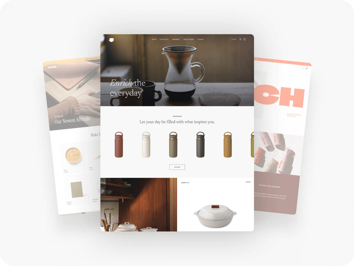
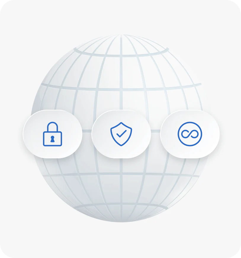
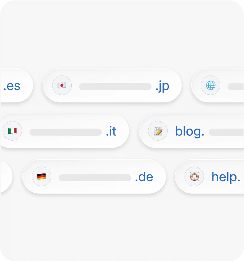
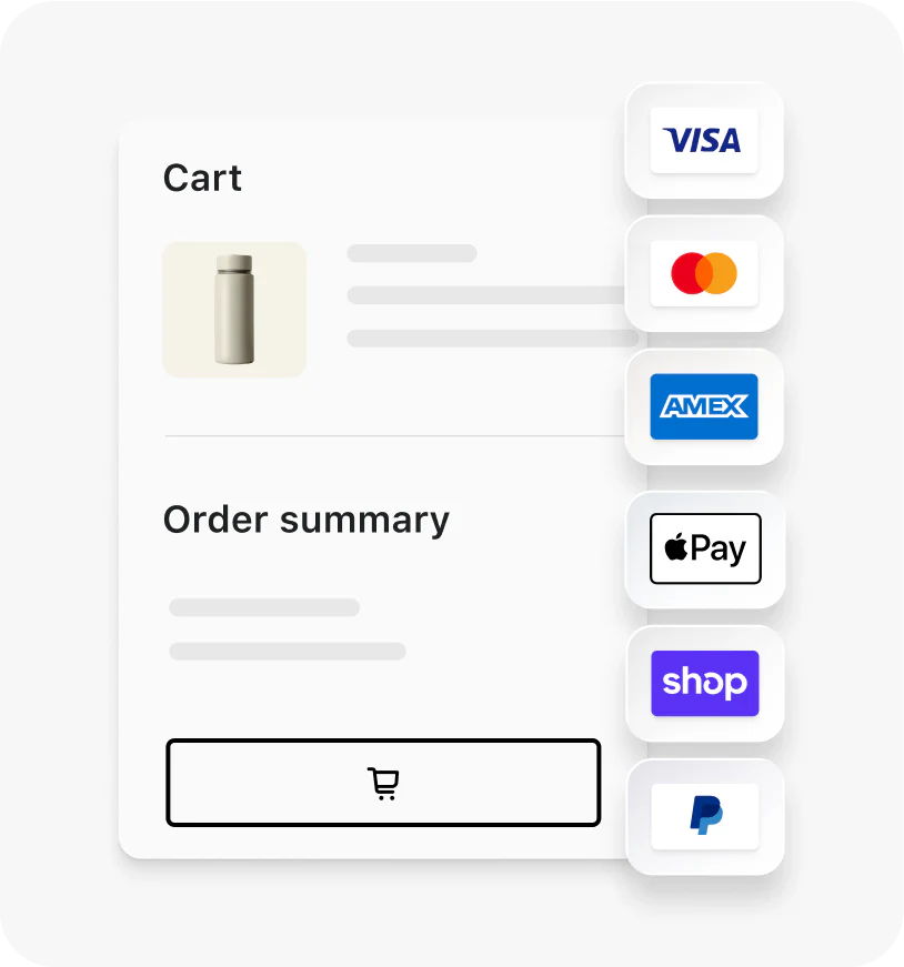
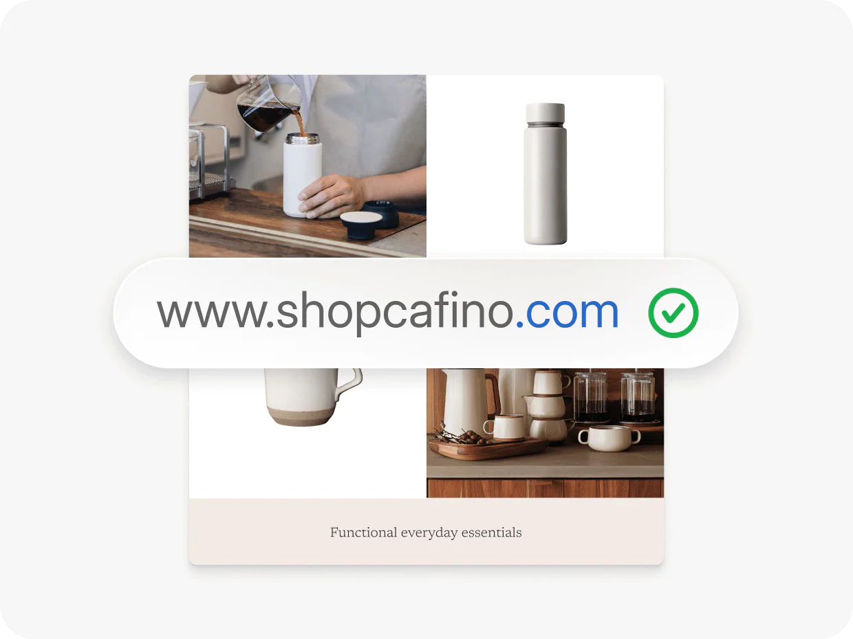
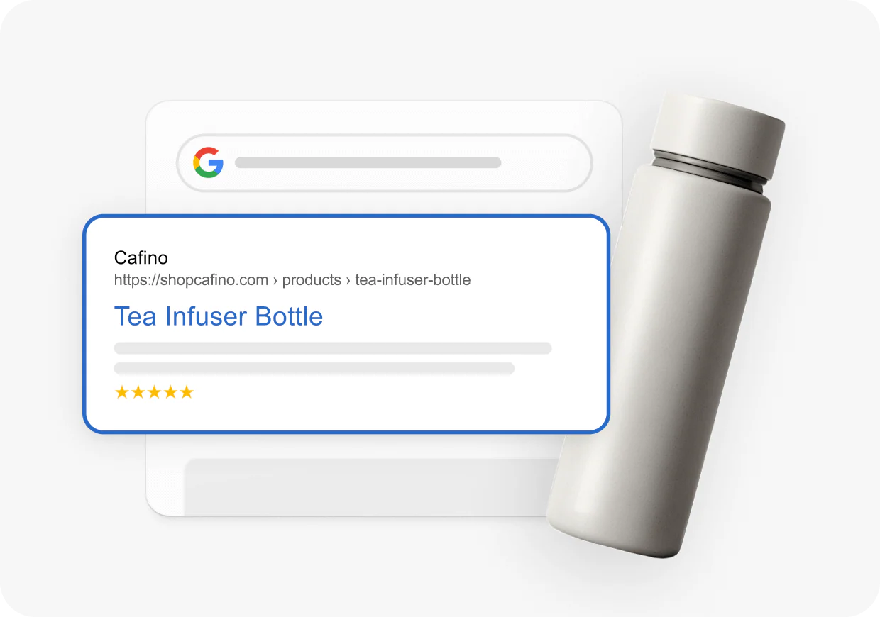
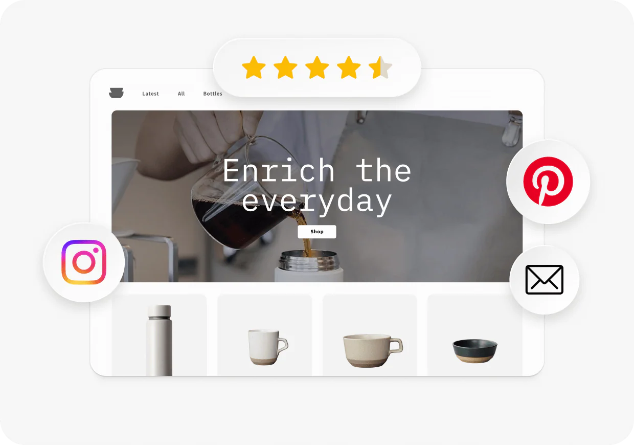
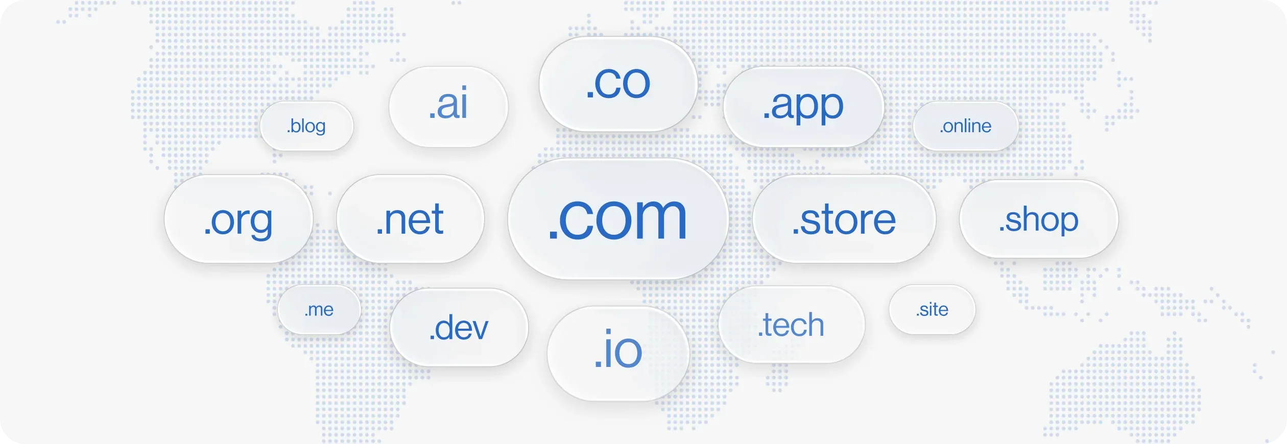
Free tools · own assets
Three tools, one visual language.
The incentive
An offer that doesn't shout.
After launch, the page took on a new job: carrying Shopify's rewards programme. Buy a domain, get $20 USD back, part of a wider system of incentives that pays merchants back in credits for every setup step they complete. The brief sounded simple. The risk wasn't: the hero had been deliberately reduced to a single action, and a promotional offer is exactly the kind of element that erodes that discipline: a coupon taped over a brand moment.
The answer was a pill: one quiet line set into the hero, designed to be read after the headline, not instead of it. I designed the component and animated the coin that sits beside the copy: a slow, continuous spin that reads as value, not discount. The motion does the persuasive work so the type doesn't have to raise its voice, and the offer becomes part of the page's brand language instead of an interruption of it.
Buy domain, get $20 USD back
Set up shop with the perfect domain
Register, host, and manage it from the same place you do business.
- Powerful online store
- Instant domain configuration
- No technical setup
- Free, unlimited hosting
Result
The page is live.
The redesigned shopify.com/domains is live and represents a complete transformation of the page's purpose: from educational resource to product argument. The narrative, structure and visual language now work as a single system, each element reinforcing the same idea: a domain bought through Shopify isn't just a URL, it's the first move in building something.
See it live ↗
Art direction & design · Olga Cacenabes, as part of the Shopify team
Screenshots © Shopify · All other visuals & motion designed and coded by Olga Cacenabes
Screenshots © Shopify · All other visuals & motion designed and coded by Olga Cacenabes
Next
Shopify Website Design
Art direction
→
