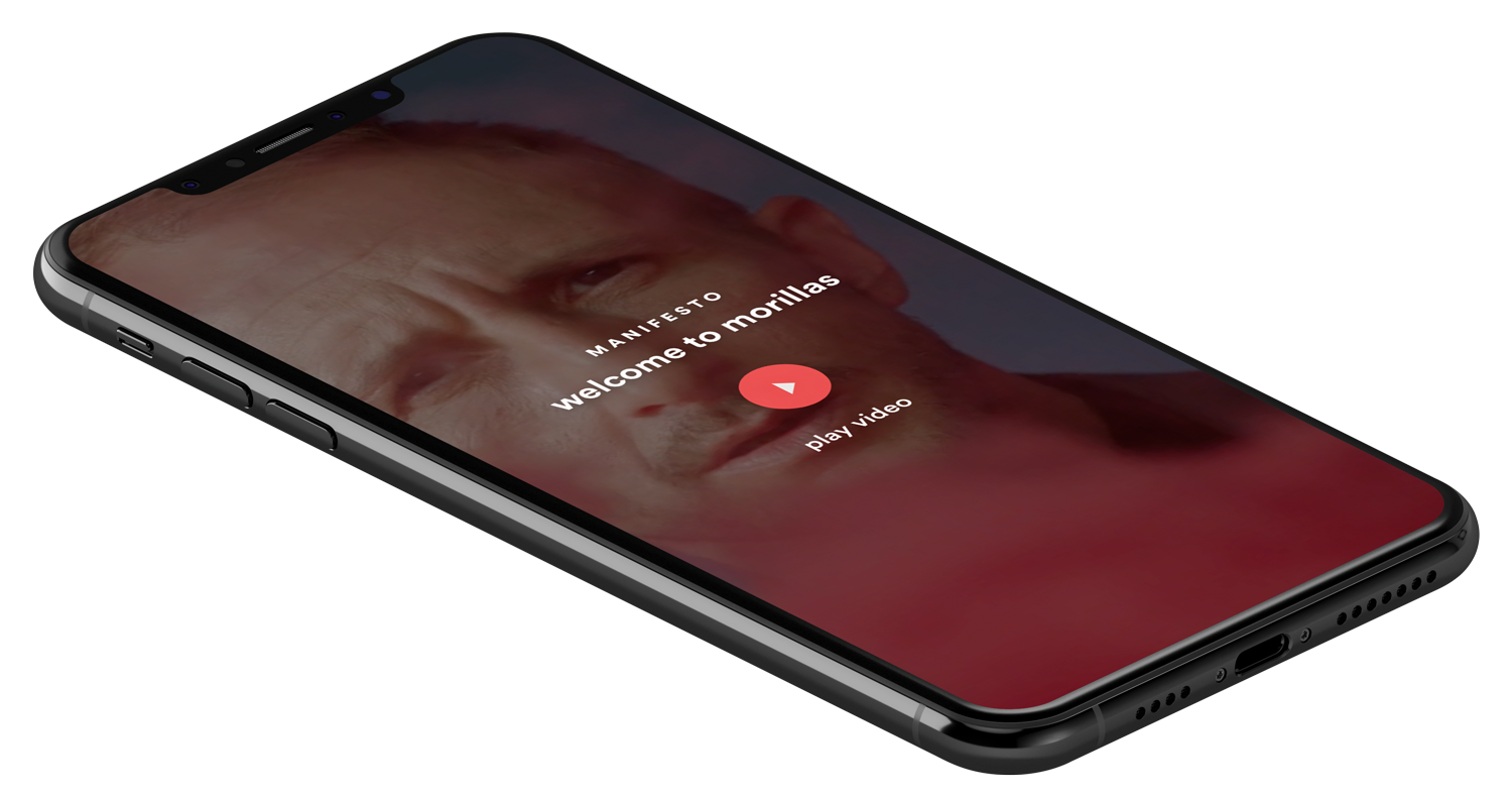

Morillas
A heritage branding house stepping into digital
Built for print, judged on digital.
Morillas is one of Barcelona's established branding and packaging studios, decades of work behind it, and a reputation built almost entirely on physical disciplines. When it merged with Redcode to move into the digital world, that reputation quietly became a liability: the combined company now had to compete in the digital market, but its site still spoke the language of packaging and print.
The brief was a repositioning. Morillas had just launched a new corporate identity, and the old site, too focused on the disciplines that no longer told the whole story, couldn't carry it. The new site had to be in tune with that identity and, more importantly, had to behave like the work of a studio that belonged in digital. The site itself was the argument.
Art direction and UX, from structure to behaviour.
I led the art direction across the site and designed the UX/UI: from the overall structure down to the behaviour of each section. The visual register, the editorial logic, the way each part of the site revealed itself: all of it had to feel like one studio across three very different experiences.
Alongside the site I applied the new corporate identity to the basic stationery, so the system held consistently from screen to letterhead.
- 01Art directionVisual register across the whole site.
- 02UX/UI designStructure and behaviour, section by section.
Three sections, three registers, by design.
The site had three parts that had almost nothing in common: a project showcase, an editorial magazine, and a section dedicated to the studio's founder. Forcing them into a single grid would have flattened the exact thing the repositioning needed to show: range, and the judgement to handle it.
So I designed three distinct experiences, each built around what its content actually demanded. One studio, three registers, and the discipline to make them feel deliberate rather than disconnected.
-
01 · PortfolioShowcaseEditorial, not a grid.
-
02 · MagazineThe HarvestComposed, not templated.
-
03 · HistoryOriginsA net, not a timeline.
A premium showcase, cover after cover.
The Showcase exists to make the work look like the best version of itself. Instead of a regular grid, the most relevant Morillas projects get presented as a curated selection, and each detail page is treated as an editorial piece: rich imagery, generous space, content that's paced rather than dumped.
A magazine that builds itself.
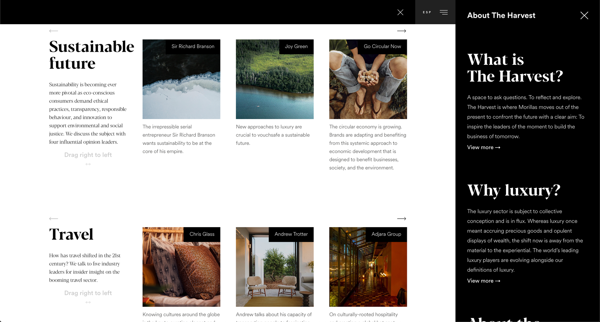
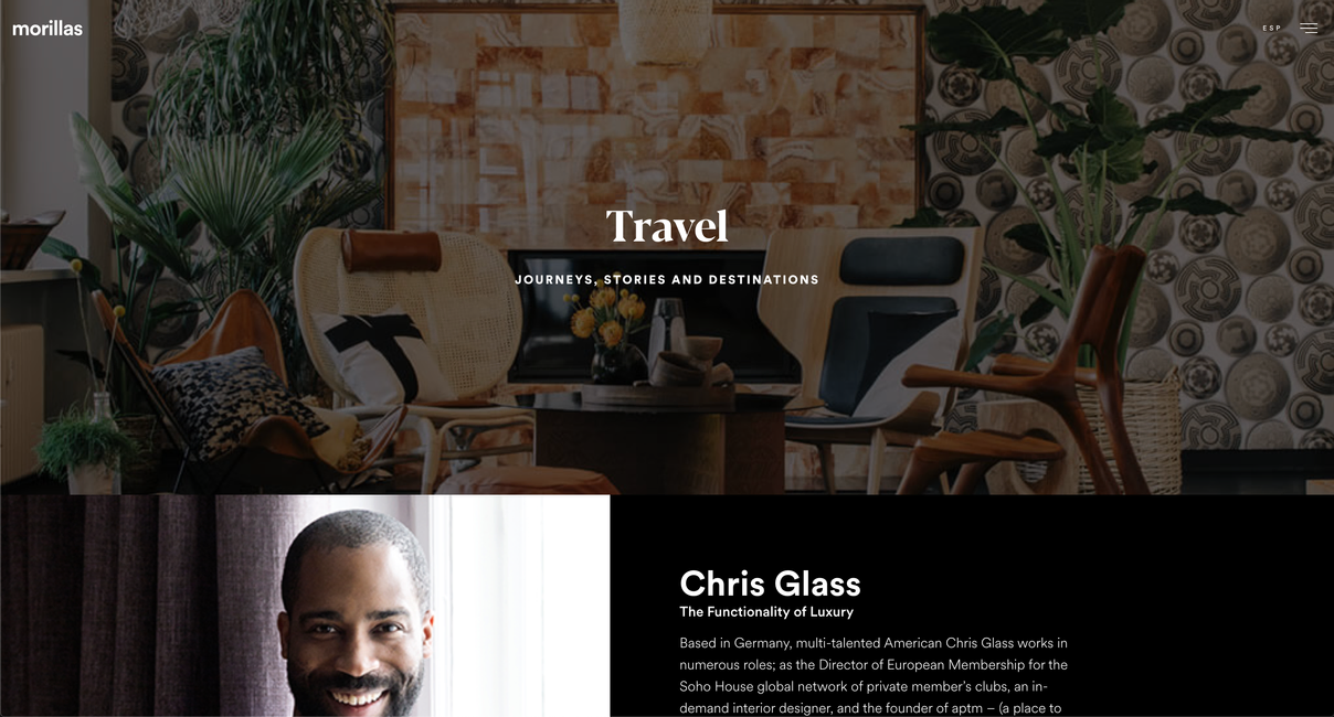
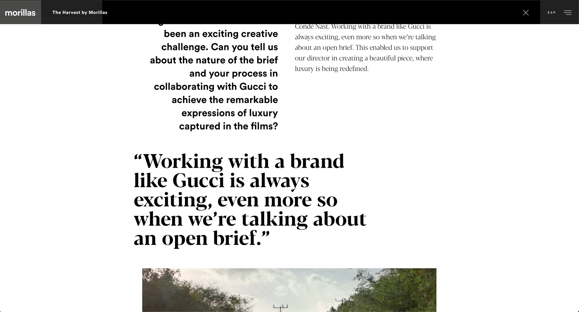
The Harvest is the studio's magazine: curated writing from leading voices in their fields. The goal there was a modular graphic system that keeps long-form content visual and easy to read. I built it from a small set of parts that combine freely, so the editorial team can compose a piece instead of pouring it into a template.
-
01
Headings
The structural anchors that set a piece's rhythm.
-
02
Highlights
Pull-quotes and emphasis that carry the voice.
-
03
Copy
Body text tuned for long-form legibility.
-
04
Images
Visual modules that drop in at any scale.
A life mapped as a net, not a line.
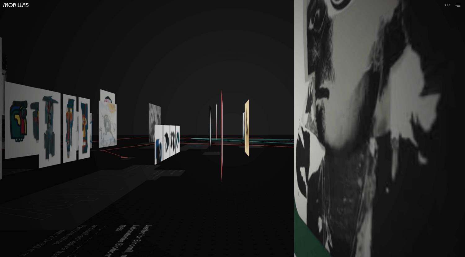
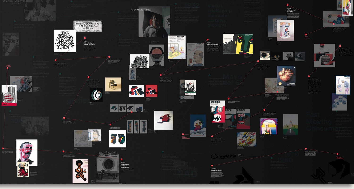
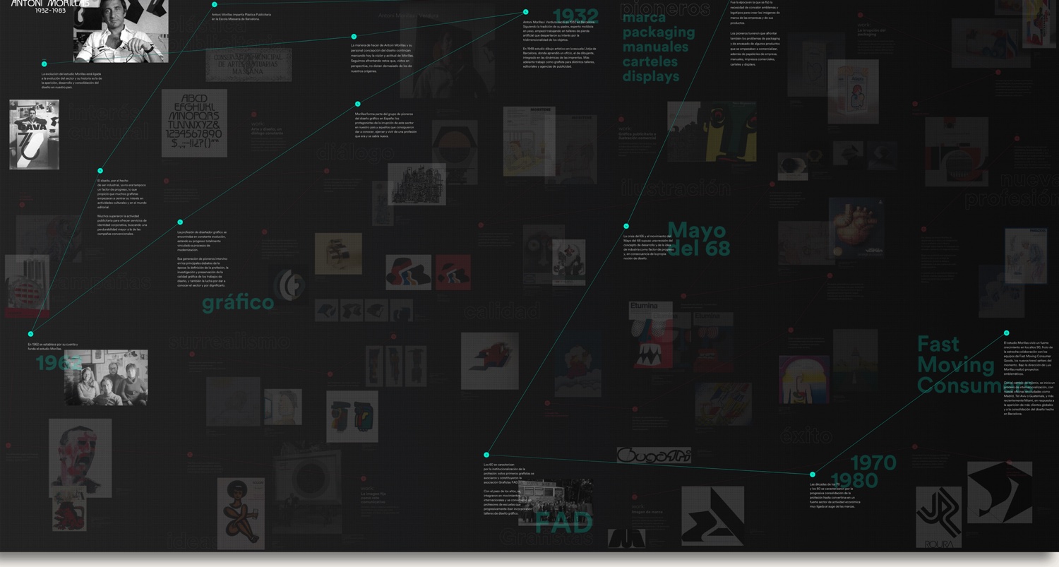
Origins is a metaphor for the life and work of Antoni Morillas. His history was too rich and too tangled to flatten into a linear timeline. So instead of a single line, I broke the events and images apart and rebuilt them as a complex net, with the connections made visible.
The section opens almost like a museum: a guided tour through some of his most iconic graphic work. From there it splits into two layers that are overlaid yet kept distinct: a red layer for the graphic artwork and a green layer for his life, so a visitor can move through the story guided, or wander it at random. Small animations and hints lead the eye without ever forcing the path.
It shipped, and won a Laus.
The result is a corporate site that reads as the work of a studio that belongs in digital: three experiences held together by one art direction, and a system that runs from the screen down to the basic stationery.
It did the repositioning job it was hired to do, and it was recognised with a Laus Award in 2018. More than the prize, it proved the point the brief was really asking about: that a branding house built on print could make something digital that felt designed, not ported.
See it live ↗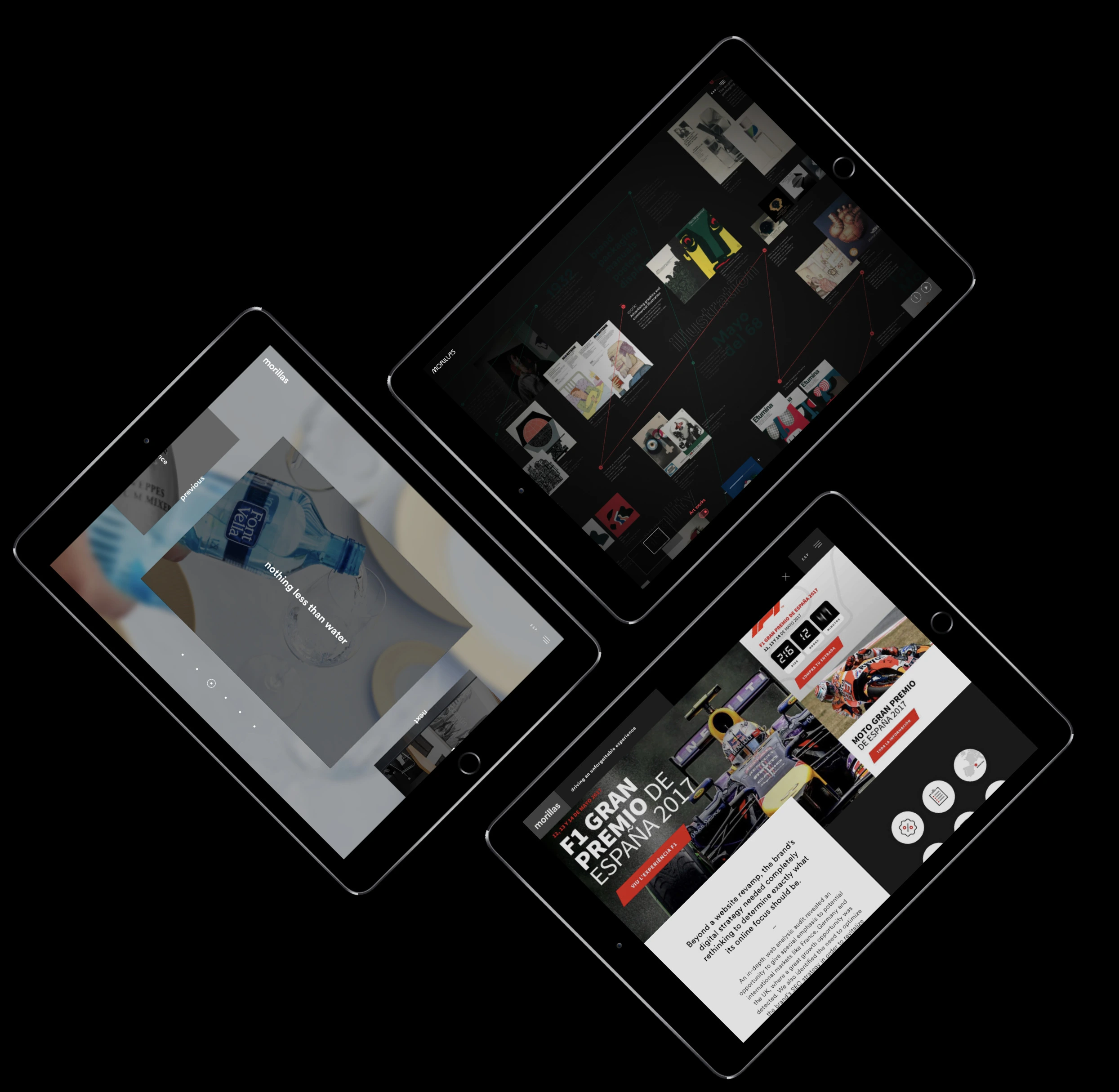
Site captures © Morillas · All other visuals designed and coded by Olga Cacenabes
