Basi Group
An umbrella brand built to disappear behind the brands it holds
One of Spain's biggest clothing distributors, and no brand to point to.
Basi Group is one of the largest clothing distributors in Spain, a company with real scale, real revenue, and an industry-wide reputation, but no formal brand identity and no corporate site to host it. The brief came in exactly there: build the brand from zero, and build the site that introduces it.
The strategic complication was that Basi Group doesn't sell to the public. It holds and distributes other fashion brands, each with their own visual world, their own audience, their own commercial logic. So the brand I was being asked to build had to feel premium and contemporary on its own terms, while never competing with the brands it represents. An umbrella, not a tent pole.
Three roles, on the same project.
I led the art direction across every surface: defining the visual register the brand had to live in (editorial, restrained, minimal) and applying it consistently from the logotype through to the site.
Alongside the art direction I handled the UX/UI design of the corporate site, and the graphic design work that the brand system needed in print and digital. Working across all three kept the brand coherent end-to-end, from the wordmark to the way the site behaves.
- 01Art directionVisual register across every surface.
- 02UX/UI designCorporate site, accessibility-first.
- 03Graphic designPrint and digital applications.
Make the umbrella quieter than what it's holding.
An umbrella brand has one job: support the brands beneath it without ever stealing focus. That single decision shaped every visual choice that followed.
I chose black and white as the primary palette: fashion's default, but also a canvas that lets any brand in the portfolio sit inside it without colour collisions. I chose a custom serif logotype that read as editorial and heritage, not loud. And I kept the system spare on purpose: enough to feel premium, never enough to feel like a brand fighting for the foreground.
A wordmark drawn for the brief, not picked from a library.
I needed a typeface that read as fashion and heritage at once: recognisable, with personality, but not theatrical. Questa Grande was the closest reference in the wild, so I used it as a starting point and redrew the letterforms from scratch: sharpening the serifs, softening the transitions, tuning the proportions until the mark stopped feeling like Questa and started feeling like Basi.
For the descriptor I paired the custom serif with Raleway, a clean sans-serif that pulls the system into the present. The contrast does the work: the serif carries the heritage, the sans carries the contemporary. Together they tell the story without anyone having to read the brand book.

Re-Drawn Questa Grande
Typeface

Black and white, with soft palettes for the product to live in.
The art direction extended the same restraint as the identity. Black and white as the primary registers: the visual neutral that fashion has agreed on for decades, and the only palette that doesn't compete with the brands Basi distributes.
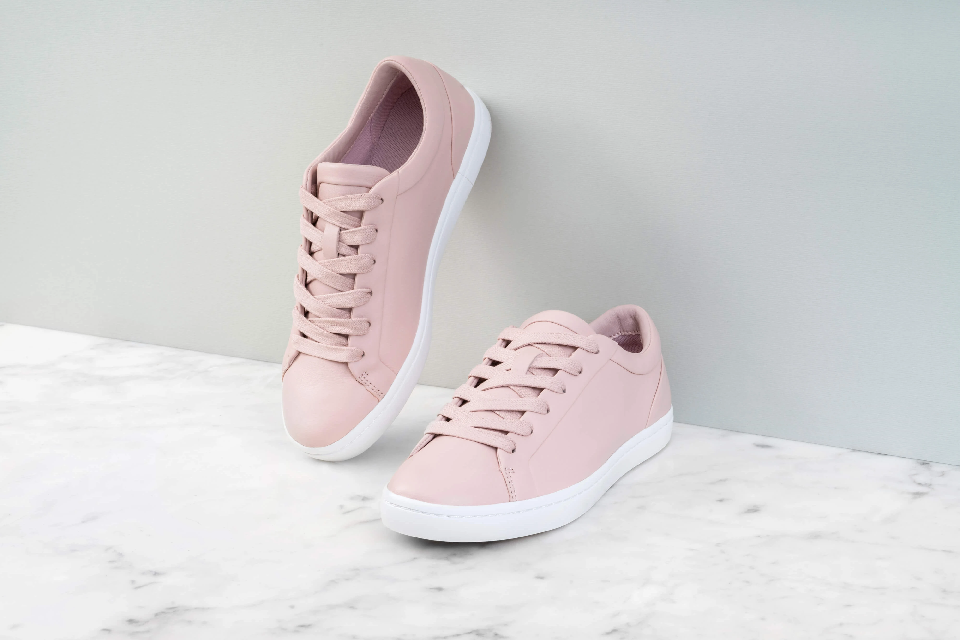
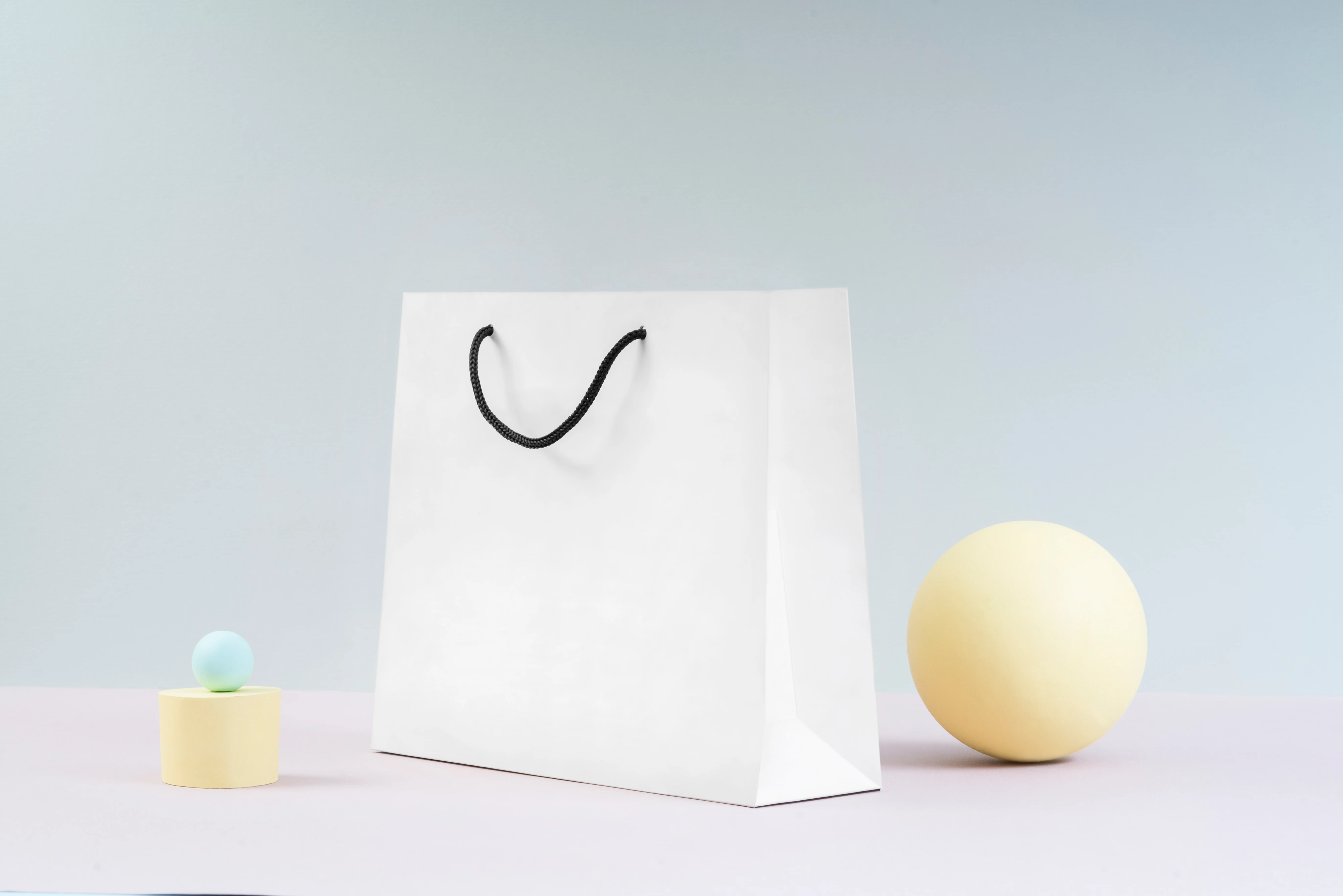
For the brand shoots I layered in soft, pale backgrounds, chosen specifically as quiet stages for product to read against. The brief to the photographer was to keep the lighting clean, the surfaces uncluttered, and the framing editorial.
Photography © PhotoMargaret


Accessible by requirement. Premium by intent.
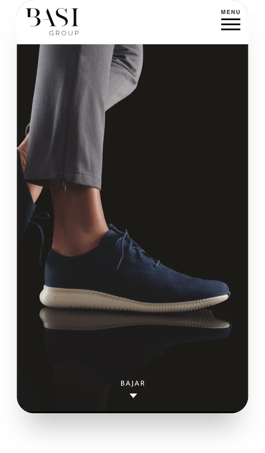
The site had a constraint that doesn't appear in most fashion briefs: it had to be accessible to people with disabilities, while still looking like the brand of a premium fashion distributor. Those two goals are usually framed as a trade-off. The work was to refuse the trade-off.
That meant making accessibility decisions structural, not decorative: navigation with clear, descriptive labels, never icon-only; high contrast across every surface (dark type on pale grounds as a non-negotiable, not an aesthetic choice); and every actionable link paired with both icon and text so the action is unambiguous regardless of how the user is reading the page.
The visual register stays editorial throughout: large typography, generous white space, restrained colour, but the underlying structure is built for assistive technology first. The decisions that make it accessible are the same decisions that make it feel composed.
-
01
Descriptive labels
Every menu, every link. No icon-only navigation, no decorative-only buttons.
-
02
Contrast as a constraint
Dark type on pale grounds, AA-grade contrast across every surface.
-
03
Icon + text
Actions unambiguous regardless of how the page is read.
-
04
Editorial composition
Large type, generous whitespace, restrained colour throughout.
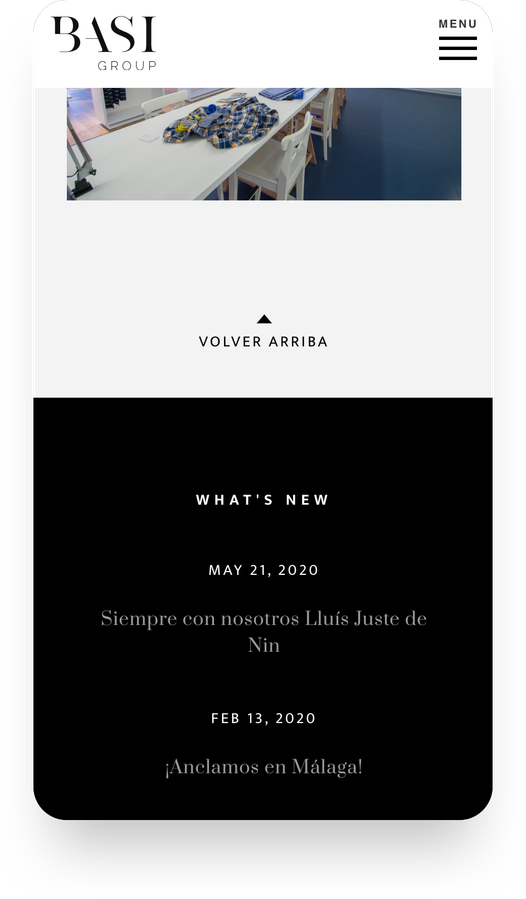
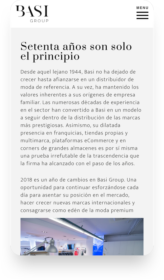
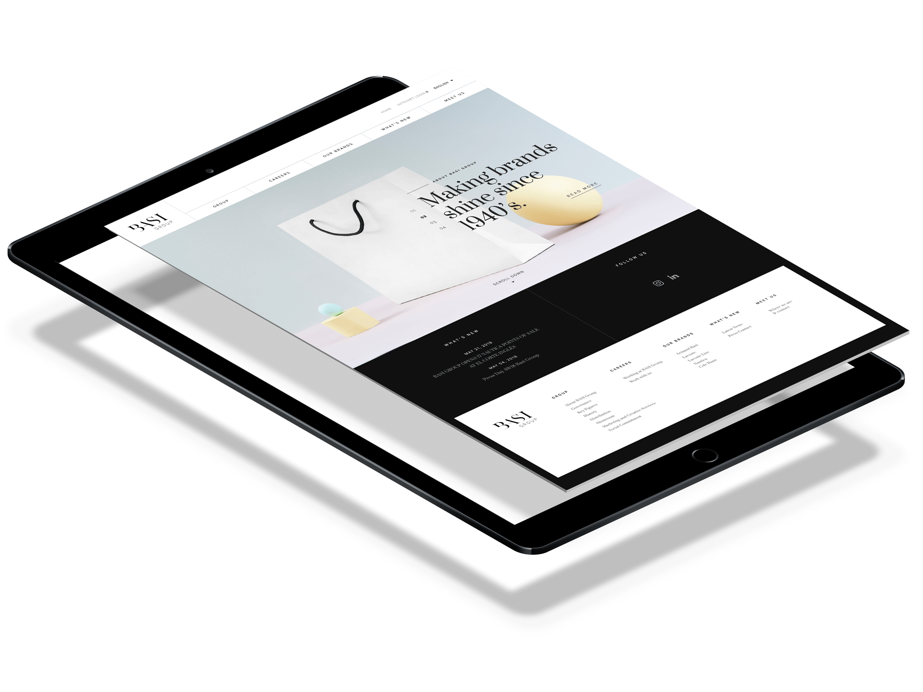
A holding brand that finally has a face.
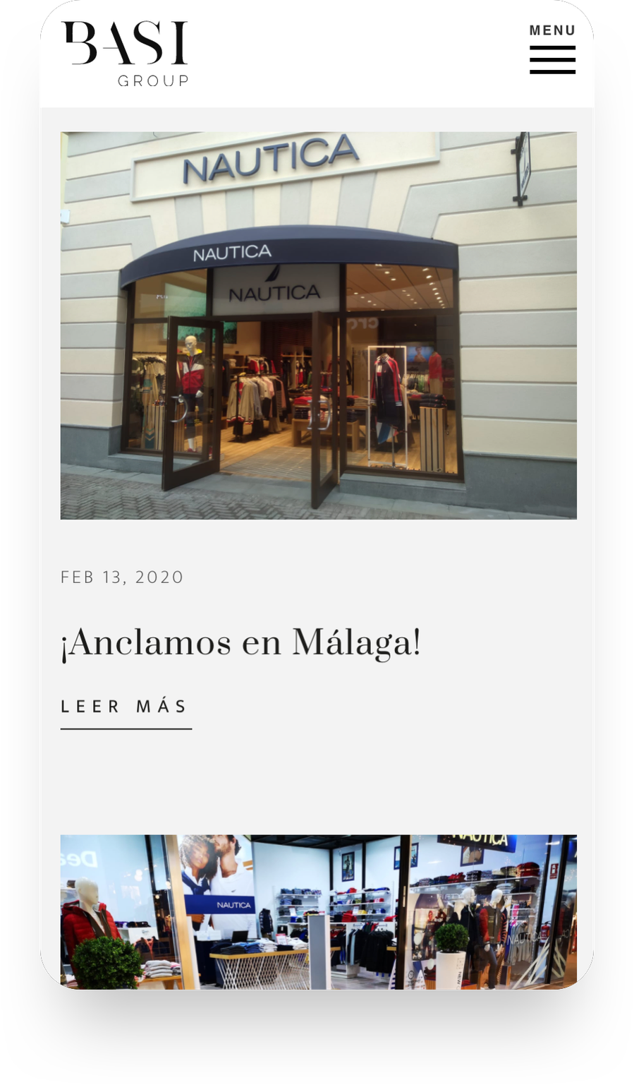
Basi Group went from a company without a formal identity to a brand with a custom wordmark, a coherent art direction across print and digital, and a corporate site that introduces it to the industry on its own terms. The system holds across surfaces and, by design, never gets in the way of the brands underneath it.
The work was a reminder that umbrella brands ask for a different kind of discipline than consumer brands: the goal isn't to be remembered, it's to make the things beneath you easier to remember.
See it live ↗
Photography © PhotoMargaret
